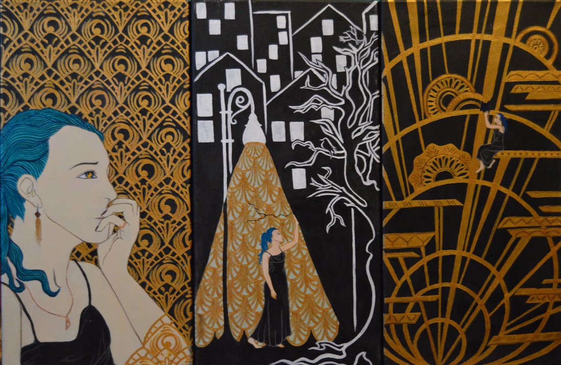
Triptych: Artist in the City
Exhibition Text
Title: Gilded City
Month of Completion: April 2016
Size: 60.96cm x 91.44cm
Medium: Acrylic on Canvas
This triptych painting was inspired by the architecture and paintings of the Art Deco movement, along with a small amount of inspiration from the German Expressionist Frans Masereel. I chose these movements because this piece is all about how I interact with my city, and I felt that these two styles represented the way I view Milwaukee. The first is a self portrait depicting key elements of myself, the second shows how the city I grew up in has shaped my perspective, and the third is representative of how I in turn shape my city.
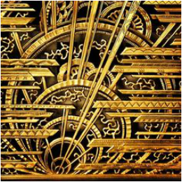
InspirationFor this triptych I used inspiration from the Art Deco movement of the 1920’s, specific artists being prints by Erté, the architect Rene Paul Chambellan, and the ceramics of Charles Catteau. I really wanted to incorporate the delicate gold elements of the era, painted with minute detail and repetition. Each figure in the pieces are done with the outlining and flat tones of Erté, elements in Artist and City in the Artist were pulled from vases done by Catteau, and the gold infrastructure in Artist in the City was inspired by bronze reliefs done by Chambellan in the Chanin Building. With City in the Artist I also took inspiration from the German Expressionist artist Frans Masereel, particularly his pieces in The City collection. |
Erté Prints |
Rene Paul Chambellan
Charles Catteau Vases |
8
|
Frans Masereel Woodcut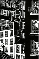
9
|
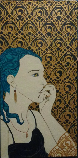
Panel One: Artist
|
MeaningI chose Art Deco as my main inspiration not only because I liked the style but because it clearly represented the bright, loud energy of the city, which I love and want to live in. In this first part of the triptych, I used the repeating design both behind me and in front to show how I am surrounded by the city and how it’s an integral part of me. In the iris of my eye I painted a flame as a symbol of my religion. My family is Unitarian Universalist, which is a relatively small religion, and the flaming chalice is our symbol or logo. I decided to make it small and almost hidden because I don’t talk about my religion a lot simply because it’s so small that almost nobody knows about it and I don’t like to constantly try to explain it. Yet, I placed it on my eye to show how it shapes my perspective and is crucial to my personality. I chose to position my hand over my mouth as an echo of the idea I used in my Digital Collage, representing my fear of public speaking and self-expression, but subtler so it didn’t overpower the other elements.
|
Process
Testing UndercoatsProcess Photos |
To begin, I stretched and gessoed three 1’ x 2’ canvases. This was my second time doing this process, which I think turned out better this time as my final dried canvases were tighter and more evenly stretched. I began with Artist, by covering the entire canvas in black paint. I knew I wanted a repeating, gold design as the background, and after research and evaluating my planning sketches, I chose to use one from a vase done by Charles Catteau. To transfer the design onto my painting, I created a stencil to trace repeatedly over the entire space. I painted this basic shape white to stand out against the black, and my original plan was simply to paint a layer of gold over this, but that proved problematic. The gold paint I had purchased wasn’t quite opaque enough to get the color I wanted with one or two coats, it looked too washed out and almost pastel. I experimented with different undercoats of acrylic to provide a base for the paint. I tried brown and yellow, but neither were right, so the best color I found was yellow ochre. Before I went ahead with that, I used photographs of myself to trace an outline of my figure and fill it in with white, to avoid hours of work on parts of the background I was just going to cover anyway. From here I painted every detail of the rest of the design with yellow ochre, and then went in with a coat of gold. This was very time-consuming and almost didn’t seem worth it, but I think the end color paid it off.
After finishing the background, I started on the figure. Using photographs for reference, I filled in my facial features and basic lines of the hair and fingers. I noticed that Erté tends to make human eyes very narrow and dramatic, so I went back in with pencil to try and demonstrate some of that technique. Also, all of his prints are made of flat tones without much shading, so mostly I just filled in the shapes of my drawing, then using line to develop smaller details, and adding a few gold details to tie it in with the rest of the painting. Lastly, I went back in with gold to overlay a few of the background shapes over the front of the figure to unify the entire piece and heighten the symbolism mentioned in the Meaning section. |
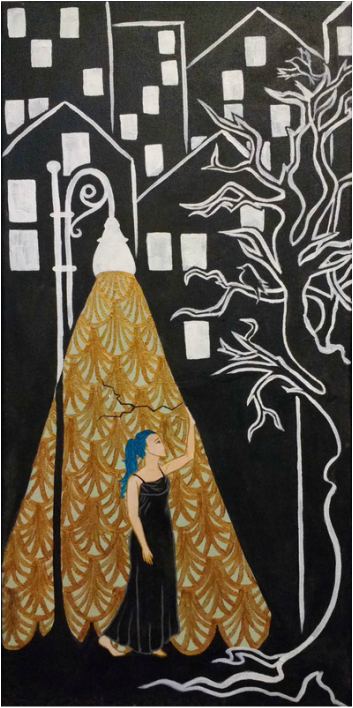
Panel Two: City in the Artist
|
MeaningIn this panel I combined inspiration from both Art Deco and the German Expressionist Frans Masereel, to show the juxtaposition I grew up with. I am fortunate enough to have been born into an upper-middle class family, and my childhood was comfortable even through the Recession a few years ago. I have always lived in quiet neighborhoods, but my whole childhood I was terrified to leave them. It made total sense to me that my parents wouldn’t let an eight year-old leave the front yard, because according to the media, the rest of the world was complete chaos and destruction. Now that I’m older I know that I am not going to die or be kidnapped if I leave my street, but I understand that hardships happen everywhere, ones that I have been fortunate enough not to experience. As graduation and college inches closer, I’m very aware of the fact that I will be leaving my safe little bubble and forced to survive ‘the real world’, which is what I have described in this painting. The light from the streetlamp becomes the glass bubble I lived in, cracked because I know soon I will break out of it, going from delicate Art Deco into harsh German Expressionism.
|
Process
|
|
With this painting I already knew I wanted to combine Art Deco with German Expressionism, so I began with the black-and-white of the background. I painted the entire canvas black, then went in with white to outline the basic shapes of the buildings, tree, and streetlight. I then used a pale gold color to block in the light cast from the streetlamp itself.
I had taken pictures of myself earlier in the position I wanted to paint, which I know used to trace the basic outline of my form onto the canvas. From there I filled in basic colors of myself as I had done in Artist, then adding contrasting outlines and detailing. I decided to extend on of the tree branches into the light ‘bubble’, shifting it from harsh black-and-white into a delicate, Charles Catteau-style branch, complete with one of the colorful birds often seen on his ceramics. I thought this design was interesting, but I had no ideas what to do in the background of the lighted section. I had thought about simply continuing the buildings in Art Deco style, but I realized that would be difficult to portray in such a small area and keep the focus on the figure inside. I then tried painting a scalloped motif I had seen in many Art Deco works, in a dark gold color. This was difficult to see against the pale gold background, overwhelmed the gilded bird, and ended up looking sloppy and uneven as I was trying to paint around the shapes in the middle. Eventually I decided just to scrap the bird entirely and paint the entire shape white again. I turned to looking at more images of Art Deco style, and that is where I discovered many of them incorporated a pale, mint green paired with gold or bronze. This color was reminiscent of the way copper oxidises over time, like the Statue of Liberty. I really liked this color, and I thought it could bring not only more life and vibrancy to this part of the painting, but more meaning, showing that while this ‘bubble’ was shiny and beautiful, it was old and aging rapidly. I filled in around my figure with this color, then overlaid a different gold motif over the whole thing. I then added a crack splintering across the gold to show how I would soon ‘break free’ of the bubble. |
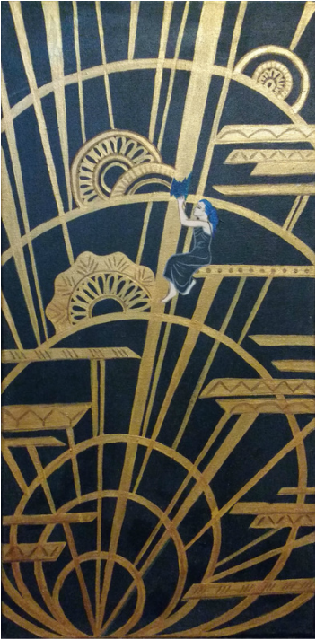
Panel Three: Artist in the City
|
MeaningWith this last panel I tried to depict the way that I affect the environment around me. I used inspiration from Rene Paul Chambellan to create this complex and beautiful but outdated structure, in which I appear small and insignificant. This I think is often how teenagers in the city both perceive themselves and how adults perceive them, as small additions to a larger structure and incapable of really changing anything. However, personally I think it’s the younger generation that ever changes anything, they’re the ones that start movements and run mass protests because they have the energy and passion to do it. To describe this concept in the painting, I depicted myself sitting among a larger, tangled gold design, and slowly repainting it. It’s a gradual process, but you can see I am the only one there to do it.
|
Process
|
|
With this last painting I again started with a solid black background, which over the three I think really contributed to furthering the unity of the pieces.
Using a design inspired by Rene Paul Chambellan’s architectural work, I began outlining the framework in the background with yellow ochre. This process took a long time because it was so detailed and complex, but overall it was less difficult than the other paintings. Once I painted the entire thing in yellow ochre, I went over it again with gold, as I had done in Artist. His work included gold filigree in the open spaces, but as I started to add this in, I thought it looked out of place and more like worms than Chambellan’s intricate design. Instead, I repainted these parts in black, then added more of the radiating lines to fill the space. I then just needed to add in my own figure, so I posed for several photos first to use as reference. From this I was able to trace a basic outline of the form, then fill in base colors as I had done in the previous paintings. I again went in with darker colors to outline shapes and add details in Erte’s style. I also added a paintbrush in my hand and blue paint to show how I was slowly but steadily changing the landscape around me. |
Reflection
Citations
1, 2, 3, 4: Estorick, Salome. Erté Graphics: Five Complete Suites Reproduced in Full Color: The Seasons, The Alphabet, The Numerals, The Aces, The Precious Stones: Erté. Cinq Suites De Lithographies = Erté. New York, 1978. Print.
5: "Ceramics." : Week 7; Artists. Web. 16 Jan. 2016. <http://baumrach.blogspot.com/2014/10/week-7-artists.html>.
6, 7: "Charles CATTEAU (1880-1966) & KERAMIS : Vase ' Lyre-birds ', 1927." French Art-Deco. Web. 17 Jan. 2016.
8: "The Chanin Building by Sloan & Robertson." Visualingual. 2013. Web. 15 Jan. 2016. <https://visualingual.wordpress.com/2013/03/21/the-chanin-building-by-sloan-robertson/>.
9: "Ineedartandcoffee: Frans Masereel and "The City"" Ineedartandcoffee: Frans Masereel and "The City" Web. 27 Jan. 2016. <http://ineedartandcoffee.blogspot.com/2011/03/frans-masereel-and-city.html>.
