Block Print
|
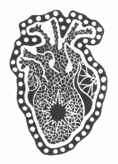
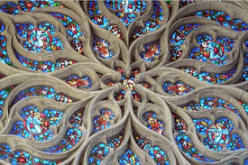
Exhibition TextTitle: Mosaical Heart
Medium: Ink on Paper Size: 22.8cm X 30.5cm Month of Completion: October 2015 This block print done in black ink discusses our culture’s obsession with love and romance. Inspired by Antoni Gaudi, I depicted an anatomical heart covered with Gaudi’s trademark over the top mosaics to show the way love stories tend to become overly emphasized and glorified. I tried to add as much decoration as possible without complicating the shape to the point where the viewer would not be able toidentify what it is, keeping in mind the limitations of the medium. |
Artistic Inspiration
|
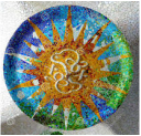
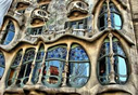
For this piece I was inspired by the Italian architect Antoni Gaudi. Gaudi is seen in art history not only as an architect but as a fine artist for the mosaics and extravagant designs he covered his buildings with. His work became so ornamental and over-the-top that the English word ‘gaudy’, meaning overly bright or showy, stems from his last name. I knew it would be difficult to create the same kind of intricate detail into a block print, but I really felt it connected with the meaning behind the piece, and I ended up enjoying the challenge. I couldn't use color the way Gaudi does as I only had one color of ink, so instead I brought in clearer definition between the different shapes of the mosaic, using this to achieve the level of detail and over-decoration that I wanted.
|
|
Process
I started with preliminary sketches of the heart, then researching different ways to incorporate Gaudi’s influence. By analyzing both the buildings and mosaics he’s done, I managed to pull out key elements that were seen repeatedly in his work.
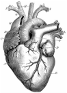
Orezende, Gustav. Anatomical Heart. Digital image. Open Clipart. N.p., n.d. Web. 27 Sept. 2015.
|
Gaudi, Antoni. Barcelona. Digital image. Yuxiangwei, 28 Oct. 2010. Web. 27 Sept. 2015.
|
Gaudi, Antoni. Digital image. SpainAttractions. N.p., 25 June 2013. Web. 27 Sept. 2015.
|
Gaudi, Antoni. Digital image. Pinterest. N.p., n.d. Web. 27 Sept. 2015.
|
Gaudi, Antoni. Digital image. Pinterest. N.p., n.d. Web. 27 Sept. 2015.
|
Gaudi, Antoni. Park Guell. Digital image. N.p., n.d. Web. 27 Sept. 2015.
|
I chose the starburst above as a central element placed in the center of the heart, as sort of a focal point. I took the sweeping curves from the above balconies and used them to imply the left and right atriums that are visible on an actual heart, and inside those I used the six-pointed flower design shown above. On the veins and arteries coming out the top I originally wanted to incorporate the spiraling towers often seen on Gaudi’s buildings, but once I got to the carving stage I felt that might make it too complicated and hard to distinguish the shape of the veins. After I laid out those designs I simply filled it in with a mosaic pattern, while really brought it together and unified the shape. I also took a dotted border I found in his work and used it to outline the whole thing, to help break up some of the negative space on the edges.
|
I ended up really liking my final sketch, so rather than trying to re-draw it on to the linocut, I used an X-acto knife to gradually cut away parts of my sketch and trace the edges directly onto the material. From then I used three different carving tools (large round, small round, and triangular) to cut away the pencil lines. I chose the largest to outline the basic shapes of the heart, the small round for the designs, and the pointed one to create thin lines for the mosaic.
Once I had the block completely carved, I began the printing process. I used water-soluble black ink, rolled it out with a brayer (small paint roller), and then used the brayer to carefully roll ink onto the block. I made several copies of the print in order to get a few god ones, and after that all that was left was to let it dry. I took a class in printmaking over the summer, so I wasn't totally new to the process, but this was the first time I did a block print without a press. With this method I found I needed a lot more ink to get a good transfer, and it took me several tries to get a print that lived up to my standards. |
|
Reflection
Overall I generally like how this project turned out, and I learned a lot about the process itself. I took a class in printmaking over the summer, so I wasn't totally new to the process, but this was the first time I did a block print without a press. With this method I found I needed a lot more ink to get a good transfer, and it took me several tries to get a print that lived up to my standards. I took a lot of time and effort to make sure all my lines were clear and deeply cut, and I think it paid off in the amount of detail I was able to get in the final print. The only thing I don't like about it is that I forgot the print would come out as a reverse image of what I carved, and the shape of the heart is less recognizable this way. I still enjoyed making it though, and this is something I'd want to do again in the future.
