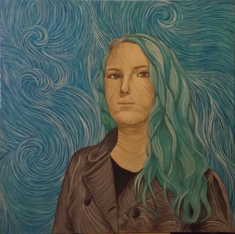
Self Portrait
|
Exhibition TextTitle: Self Portrait: Milwaukee
Size: 91.44cm x 91.44cm Medium: Acrylic on Canvas Month of Completion: December 2015 This self-portrait was inspired by Vincent van Gogh’s Self Portrait: Saint-Rémy, from the Post-Impressionist artistic movement. I chose this inspiration because I have always really loved Van Gogh’s painting style, along with already having studied parts of life and impact on the history of art. With this painting I tried to apply the same movement and energy to my work, and keeping his method of using lines of straight color rather than blending, and the darker outlines that give it a subtly illustrative quality. |
Artistic InspirationThis painting was inspired by Vincent van Gogh’s Self Portrait: Saint-Rémy. I chose this one because I was always very drawn to Van Gogh’s artwork, and since so many of his works are self-portraits, it was easier to show a stronger historical influence in my work (one of the main components of this assignment). I liked this portrait specifically for the way he describes still forms with this erratic, pulsing movement. His painting comes off as very rough, with bold brushstrokes, but with my piece I went more delicate and soft to reflect my personal style.
|
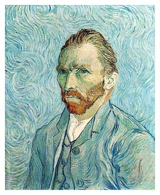
Van Gogh, Vincent. Self Portrait: Saint-Rémy. Digital image. Vincent Van Gogh - A History in Self Portraits. N.p., n.d. Web.
|
ResearchWhen I began this painting, I really wanted to make sure I understood both Van Gogh’s painting style and his life at the time of the painting in order to better emulate his technique. This particular self-portrait was done after he spent a year at the Saint Rémy insane asylum in 1889, one year before his death. Many art historians believe this painting to show a man falling apart inside while attempting to seem put together. You can see the eyes and face are the hardest features drawn, and from there outward the painting becomes looser and more free-flowing through the coat and hair, devolving into wild, erratic swirls of color, seeming to represent the inner turmoil of an unstable man. Another key aspect is the way his orange-red hair makes a sharp contrast to blue tone in the rest of the piece, giving a jarring energy to it.
|
Process
|
For this painting I stretched and gessoed my own canvas, which I have never done before and actually enjoyed doing. First, I took four 3-foot wooden stretchers and fit them together to create a perfect square, using a staple gun to lock them in place. Then I took a large piece of canvas fabric and stretched it over the entire frame, stapling the edges to the back and flattening corners. After it was stretched and stapled, I painted gesso over the entire thing. Gesso gives the canvas a better surface to paint on and it shrinks as it dries, pulling the canvas taut against the wood. The only difficulty I had with mine is that I thought the gesso would shrink more than it actually did, so my canvas came out a bit looser than I wanted it, but not so much that I had to start over.
|
Once my canvas was ready, I started researching and exploring Van Gogh’s art, especially this self-portrait, to figure out how I would emulate that same style. I researched both his style and his life when he created the painting (more on this in the Research section). I also found videos and tutorials for imitating Van Gogh’s self-portraits, along with Starry Night.
|
|
|
I began painting the background before anything else, giving it a base coat of blue, then layering in blues, greens, and whites to show the swirls and spirals, and gradually develop that same energetic, flowing movement with the colors. I painted around 5-6 of these layers, which took much longer than I thought it would, about four solid days of painting. Then I started outlining myself from the shoulders up, gridding out the canvas and a photo of myself to transfer the basic shapes, and filling it in with white paint to give myself a better base to paint on.
|
|
The first part of my figure that I started filling in was my hair. I think I really built up a good basic understanding of Van Gogh’s technique in painting the background, and painting my hair was a good transition from that because they are so similar. Just like with the background, I built up layers of shadows, midtones, and highlights to describe the forms. Over a short period of time I managed to develop a system of layers that best emulated Van Gogh’s style, and to understand where the shadows and highlights should be when I couldn’t quite tell from the photo.
|
|
Next up I did my coat and shirt, because on the whole, Van Gogh’s clothes are the most loosely painted and have the most free-form movement of his entire figure, which I thought would be good stepping stone from the wild, more abstract swirls of the background to the harder, sharper shapes of the face. Again I applied the same process of dark to light, also keeping in mind how the fabric was stretching and moving over the form and trying to emphasize that same movement in my painting. I also noticed that Van Gogh tends to outline his forms in darker colors, even using almost black on his face at times, so I added the same concept to mine.
|
|
The face was probably the most difficult part for me, I found it very difficult to get the shapes and proportions right. I started by laying down a base tone, then redrawing the grid on top of it to copy the basic shapes of my face from the photo I was working with. That was the hardest part; after I finally drew those correctly, I could follow the same process again of working in lines from dark to light. The only difference in technique was that I tried to make the shapes much sharper and harder than any other part of the painting, the same way Van Gogh does in his.
|
Reflection
This painting was the most time-intensive project I have done so far; it took me over a month to complete. The facial features were the most difficult part, keeping the proportions correct while also utilizing Van Gogh's signature painting techniques was a challenging juxtaposition, and though I think it came out well, I am still not fully satisfied with the way it looks. I did enjoy most of the painting, and doing such a large, long project really built both my skill and confidence in painting, and trying to imitate this style forced me to be bolder with my brushstrokes and let the forms become so much more flowing and free-form than I've ever been able to do.
