Abstract vs Realistic Self Portrait
|
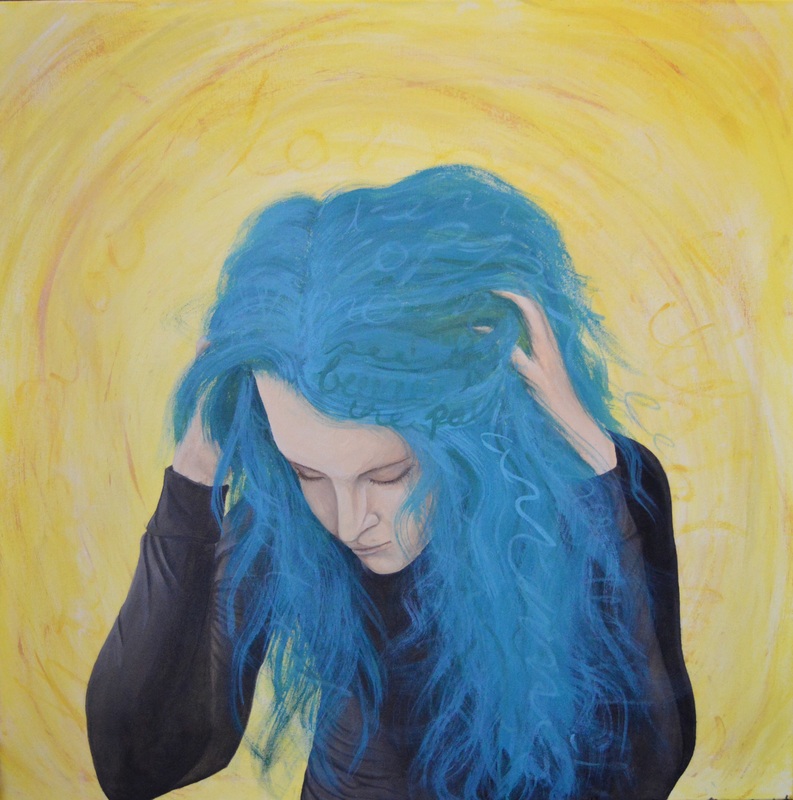
Exhibition TextTitle: Soft Spoken
Size: 91.44cm x 91.44cm Medium: Acrylic on Canvas Month of Completion: 10/2016 This self portrait was inspired by the work of two local Milwaukee artists, Adrienne Pierluissi and Kelsey Becker. The piece attempts to combine influence from two different artistic styles, beginning with realism in the face and figure, and moving into abstraction through the hair and into the background. With this painting I wanted to communicate the idea that the color of my hair speaks volumes and expresses more about my personality than my words ever could, this idea furthered by the addition of text into the hair itself. |
|
|
InspirationThis portrait was inspired by two local artists working in Milwaukee, Kelsey Becker and Adrienne Pierluissi. These are very different artists; Pierluissi’s work is very abstract-expressionist, while Becker’s style is self described as ‘abstract realism’, contrasting detailed, realistic portraits with abstract, expressive surroundings. Both of these styles are reflected in the work, beginning with Becker’s realistic style in the face and body of the figure, and developing into Pierluissi’s abstraction as it works through the hair and towards the outer edges. I also attempted to explore both artists’ use of text in the work. The script I used is very reflective of Pierluissi in that the words are made to flow with the movement of the painting, not necessarily to be read. Pierluissi herself said that she hoped the words she included did not have to be read in order to understand the paintings, that they were there for subconscious effect and meaning, and that is exactly the idea I wanted to apply to my self-portrait.
|
Planning
|
|
Before beginning the painting itself, I created a few sketches to outline what I wanted to paint and the overall composition. I wanted to highlight the idea of a closed off figure contrasted with the wild shapes and bold color of the hair, so I drew one with her hands and arms essentially shielding the face. I liked this positioning, but I didn’t know the angle I wanted the viewer to see, so I created two more with different angles, one straight on, one at a ¾ profile, and the original from the side. I decided to go with the ¾ because it put one of the arms directly between the viewer and the figure’s face, which I thought best demonstrated the meaning behind the piece.
|
Experimentation
I began with the background of the painting, the most abstract part of it. I knew I wanted it to move and flow like Pierluissi’s work, but I didn’t know how or even what colors to use. So before I tried painting the canvas without knowing what I was doing, I painted a few squares of color in my sketchbook first. I wanted something the contrast with the blues and greens of my hair, so first I thought to use the complementary orange, but I knew right away that this would be way too harsh and bright, to have two such loud colors competing on the same canvas. However I did like the idea of using warm versus cool colors, and this is when I began experimenting with shades of yellow. The first two I painted with yellow, yellow ochre, and burnt sienna, layering the colors over one another to create a unified flow. I liked the movement of the colors, but the brown shades looked too dark mixed in, and just ended up making the yellow look dirty. Instead, I replaced the brown with some white, creating more pastel, cream shades to compliment the yellow. This was much closer to what I had envisioned for the work, and as I was experimenting with color I also found the shape I wanted to create with the color: rather than the linear flow of Pierluissi’s paintings, I chose to develop a circular one, radiating out from the central figure to enhance the meaning behind the entire painting.
Process
|
|
After experimenting with color and movement in my sketchbook, I started to apply the same ideas and techniques to the canvas. I started with a pale yellow basecoat, then mixing different shades of yellow with white and using a wide brush to develop a circular pattern with the marks, attempting to blend the colors as I went to mimic Pierluissi’s style. I also added a bit of yellow ochre and burnt sienna to contrast it a bit, but not too much as I had learned in the Experimentation section. Finally I added a bit of gold paint for interest, and as a mid tone between the yellow and brown shades.
|
I photographed myself in the position I wanted to paint, then used the grid method to transfer the image to the canvas. I drew grids over both the photograph and the canvas in white chalk, then used these as reference to draw the outline of the figure on the canvas in pencil. I have done portrait paintings before, but I wanted to really focus on demonstrating Becker’s technique, so I watched a few of her time-lapse videos to study the way she works. I found that rather than focusing on small areas at a time, which is what I’ve always done, she develops the face as a whole, diluting her paints with water to build thin layers of color over time.
|
|
|
I began applying this same technique to my work by first washing the entire shape in white to provide a base and avoid the yellows of the background interfering with the new colors. I then started mixing a base tone and brushing this over the whole face, blending with the graphite outlines instead of covering them so as not to lose the original drawing I created earlier.
|
Next I worked in some shadows, using very subtly darker and darker shades to build the forms of my features. I also thinned my paints with water as Becker had done, allowing me to blend the paints very smoothly, and almost giving it the quality of a watercolor. I used the same technique with the highlights, brightening the high points of my face, then used dark brown to add fine details. I applied this process again to the hands, using the same idea of working dark to light.
|
I moved to working on the body of the figure, more specifically the dark shirt she is wearing. I took the same approach to this as the rest of the figure, working in washes of color from dark to light. The only thing different with this was now I had to show the folds and wrinkles of the fabric as well. To do this I first outlined each fold in a dark gray, following the swirled lines I saw on the photograph I was working with. Then I added a highlight color right next to each dark line, and finally I blended these colors together with a damp cloth. This process was very simple but ultimately yielded what I thought was a clean result.
|
|
|
|
After I finished the figure, I moved to the hair. I wanted the hair to be more abstract than the figure, somewhere between the face and the background. I used a natural bristle brush for better texture, and applied various shades of turquoise in abstract swirls, layering different colors to build texture and depth.
I was able to interview the artist Adrienne Pierluissi about her artistic process, and one thing she suggested to me when trying to emulate her style was not to use a traditional brush. She uses things like chains and mops in her paintings. I didn't have access to this kind of stuff, so instead I altered some of my own materials. I tried holding a brush with my fingers splaying out the bristles, using a crushed up paper ball, but I think my favorite method was taking an old brush that had been hardened with dried paint and cutting apart the bristles. This gave it a random, spontaneous texture, and I had to relinquish some control, but I think it paid off in the end. |
To finish the piece, I wanted to demonstrate further influence from Pierluissi's work, namely the way she uses text in her paintings. I was drawn to the way her script was just legible enough to be recognized as a word, but on the whole un-readable. I decided to add words to the hair of the figure, for reasons explained in the Meaning Section. I took a wet brush and a few colors I had used previously in painting the hair, and sketched out words in a style that would be illegible to the viewer, merely giving an impression of words rather than presenting full ideas or sentences.
Meaning |
Reflection |
|
The meaning of this piece relates to many of my previous works, centered around the theme of self-expression. I wanted to communicate the idea that my hair and the color of it speaks volumes about my personality that I often do not communicate with words. I am usually a very reserved, closed off person, to which the brightness of my hair draws a sharp contrast. I chose to apply Becker's realism to the face and body because while beautiful, personally I think realistic style expresses less emotion than abstract, so I used this idea to represent the way I often present myself to others. In contrast the color and movement of the hair acts as an outlet for personality and expression. I furthered this idea with the script woven into the hair, each word represents something to me or describes an event in my life. However, I didn't want the individual meaning of each word to draw from the overarching meaning of the piece as a whole, which is why I made them illegible to the viewer. It's still understood that the shapes of the hair form words, and so the viewer is able to understand the meaning behind it without needing to understand the words themselves.
|
What I liked: I am happy with the way the realistic parts of the piece came out, I think I was able to apply Becker's techniques successfully. I think the colors ended up working very well together in this piece, I was afraid that the yellow and turquoise would both be too bright and overpower one another, but I think because I made the yellow much paler it complemented the darker teal hues. I also think the abstraction of the background adds an aura of movement around the figure.
What I didn't like: I think the hands look odd compared to the rest of the piece, their positioning puts them at a weird angle to the viewer and makes them look incomplete of out of proportion. The hair could use more depth, perhaps a stronger variety of colors and tone would add life or movement to it. I also think I could have added more to the background in the same way, as it is there isn't much development of colors the way Pierluissi incorporates in her paintings. |
ACT Questions
- Pierluissi's Four Seasons paintings inspired me to explore abstraction and to combine colors in a way I have not done before, forcing me out of my comfort zone. Conversely, Becker's work pushed me to develop skills I already had when working with realism and figural painting.
- When I interviewed both of these artists about their processes, both were very excited to talk about their particular style and past work, showing a deep passion for what they do.
- I learned a lot from interviewing Adrienne Pierluissi about the way abstract art can impact a person. Abstraction was never really something that I felt like I 'got' when I first saw it, but her perspective on it has deepened my understanding of the movement.
- The central idea of my research was to find a way to portray my hair as more energetic and louder than myself, which I realized through the combination of realism and abstraction.
- I concluded in my research that when done correctly, abstraction is something that can express more movement and emotion than I previously thought. I also inferred that while I might paint with the intention of a certain kind of expression, others may view it in a completely different way.
