Milwaukee Flag Re-Design
|
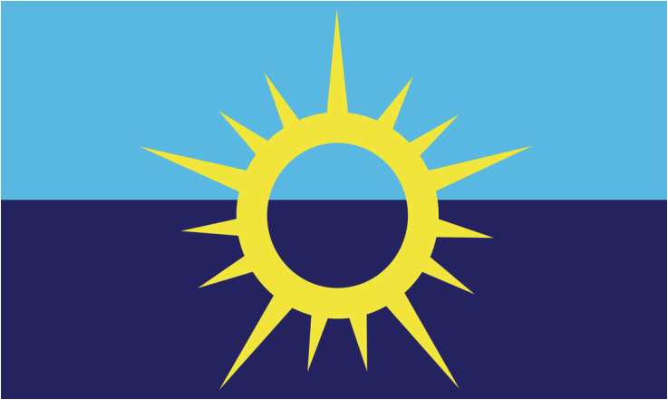
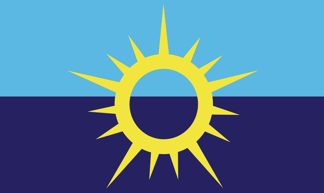
Exhibition TextTitle: Sunrise Over Water
Size: 91.4cm x 152cm Medium: Digital Collage Month of Completion: November 2015 This piece is a re-design of the Milwaukee flag, using a very small color scheme and simple, symbolic elements. I chose tones of blue and yellow because historically those have been very prominent colors featured in official Milwaukee seals and crests, and the sunburst element to symbolize both the sun rising over Lake Michigan and the many areas and neighborhoods of Milwaukee coming together into one, unified symbol. For this piece I primarily used Adobe Illustrator, all work was made by me. |
Inspiration
|
My inspiration for this piece was Frederick Brownell, the man who created the South African flag in 1994. His work is deeply symbolic and combines colors in a way the unifies the piece and heightens the symbolism. I wanted my own work to demonstrate that kind of symbolism. I also applied influence from official Milwaukee crests and seals, to show the history and heritage of the city, along with the logo from the University of Milwaukee, which has been a very strong part of Milwaukee culture since 1885.
|
|
Process
I began the planning process with small, quick planning sketches to lay out the basic elements of my design. I made these sketches very small evaluate what the actual flag would look like from a distance, and to avoid becoming overly detailed. At first I created sketches based around the wheat stalk featured in the original Milwaukee flag design, placing multiple stems in circular or starburst patterns. While these designs had good historical influences, I just didn’t feel that they represented the modern Milwaukee as well as the historical. From there I started analyzing the official seals and crests of Milwaukee, where I found that navy blue and gold were very prominent colors in almost all official Milwaukee designs. Using these as a base for the color scheme, I started looking for elements to pull from Milwaukee heritage and culture, and I found the logo for the University of Milwaukee (UWM) featured a beautiful half-starburst design that could be manipulated to represent the city. UWM has been such a steady part of our culture for over a century that I thought it would be a great way to tie historical Milwaukee to modern Milwaukee; using its central college to show its steady growth. I took this shape and extended it into a full, circular starburst placed in the center of the flag (reasoning behind this decision in the Meaning section). Once I created several planning sketches to outline my design, I moved to working in Adobe Illustrator™. I’d used this program before and knew the basics of how it worked, so it was a logical choice to use for creating my final flag designs. I also liked using this because the way the program is set up allows you to take designs and stretch or shrink them to any size you need without affecting the quality.
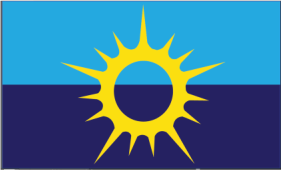
Once I had this first design completed, I talked with Phil Belair, a professor from the Milwaukee Institute of Art and Design, for an in-process critique of my work. I received some good advice from this, and decided to alter the background to two tones of blue, just to further clarify the symbolism of the rising sun.
Once I had this first design completed, I talked with Phil Belair, a professor from the Milwaukee Institute of Art and Design, for an in-process critique of my work. I received some good advice from this, and decided to alter the background to two tones of blue, just to further clarify the symbolism of the rising sun.
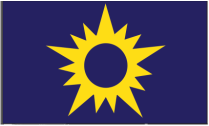
Beginning Design
|
More Refined
|
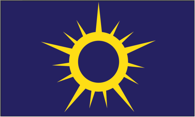
Experimenting with Adding Curves
|
Final Design
|
Meaning
When I started exploring Milwaukee’s cultural symbols to use as influence, I really liked using navy blue and gold as a base scheme because the navy could be used to represent the water of Lake Michigan being so central to the city, and the gold describing the golden wheat of Wisconsin’s farmland. Using blue to represent the water has also been used in the flags of Chicago and Madison, but theirs’ are sky blue rather than navy, which I also thought could serve to differentiate Milwaukee from those two cities. When I took the UWM logo and made it into a full circle, which resembled both the shape of the gear on the original Milwaukee flag and the sun as it rises over Lake Michigan. I chose the size and number of points on the shape to demonstrate the many different neighborhoods of the city, critiquing the fact that Milwaukee is one of the most segregated cities in the U.S., and presenting them as one, unified symbol. The largest points represent the major sections of Milwaukee: the East, West, North, and South sides, and Downtown. In between those points are the smaller ones describing the neighborhoods within those areas, like Bay View, the Third Ward, and Riverwest. At first I just had this element on a navy background, but in the end I used a two-tone background to better develop the symbolism of the sunrise over the lake.
|
Reflection
I really enjoyed working on this project and mediums I used to create it. Symbolism is something I always enjoyed working with in my English classes, so it was very interesting to be able to further explore that area in an artistic medium, translating my written understanding into something visual. I was very satisfied with the end result and would definitely work with this medium in the future.
|
