Block Print Diptych
|
|
Exhibition Text
Title: Peace and Passion
Medium: Ink on paper
Size (each): 22cm x 28cm
Month of Completion: December 2016
This diptych is comprised of two prints made through block printing, and communicate my perspective on gender and feminism. These two pieces show completely different sides of women, and together they demonstrate the complexity and duality of womens' personalities. Too often I have seen the women around me grouped into narrow categories, stereotyped based on limited perceptions. I used personal experiences in this diptych to challenge that notion and present a more cohesive view of women.
Inspiration
|
These prints were inspired by the Japanese genre of Ukiyo-e block prints, specifically the work of Katsushika Hokusai. I was inspired by the minute detail he put into his work, and the clean lines that formed his figures. I tried to work the same level of detail and intricacy into my own work, and while my subject matter and forms are more modern and and simpler. I also chose not to include color in my work, I wanted the simplicity of black and white to set off the minute detail and add a boldness to my images.
|
|
Planning
|
|
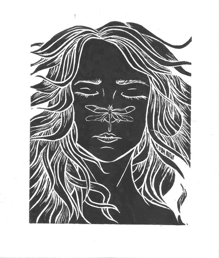
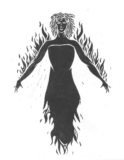
I first formulated the idea behind the works: to portray contrasting characteristics of women to show their duality and complexity, I wanted to demonstrate that women can be both passionate and peaceful. I decided to do this by incorporating contrasting elements, specifically fire and water. I sketched different positionings for each figure, finally deciding on a sleeping face for peace, and a powerful stance for passion, based on the Mountain Pose in yoga.
|
Process
|
I began this process by creating a final drawing for each, working from the sketches I’d done earlier. I then filled in the back of the paper with graphite, taped it to a linocut piece, and carefully traced the outline of the form. Using this method transfers the drawing onto the material beneath without having to redraw the image.
|
|
With the drawing completed on each piece of linocut, I used a square-shaped carving tool to carve out the outlines. I used more pressure on the outer lines and lighter on the inner details, to create a strong, clean form while keeping those details fine and delicate. This was a long process because I found it difficult at first to maintain control over the tools; more than once I slipped and cut my hand with their sharp edges. Despite this, I managed to overcome my initial difficulty and eventually improve my skill. After completely outlining the form, I used a wide, round tool to carve away the background.
|
|
Once the carvings were complete, I began the printing process. I used a palette knife to spread ink on a tray, and used a brayer to roll the ink from the tray onto the carving. Centering a sheet of paper over the carving, I placed it on top and used a baren (a flat disk in a bamboo sheath) to apply pressure to the paper and evenly distribute the ink onto the page. I had to repeat this process many times as it was difficult to transfer enough ink onto the page; I ended up having to use a lot of ink to get the desired result.
|
|
Upon looking back at the prints, I decided that simply using more ink was not working the way I wanted it to. The entire image could be transferred, however the excess ink caused many of the smaller details to be lost. Instead, I took one of the prints with a lighter ink layer, and used thinner India ink to fill in shapes with a paintbrush. When dry, the India ink looked identical to the printing ink I first used, and this method allowed me to save the smallest details.
|
|
MeaningWith these prints I attempted to communicate my own perspective on gender and feminism. These two pieces show completely different sides of women, and together they demonstrate the complexity and duality of womens' personalities. Too often I have seen the women around me grouped into narrow categories, stereotyped based on limited perceptions. I used personal experiences in this diptych to challenge that notion and present a more cohesive view of women. The first, Peace, gives the calm serenity we are capable of, confronting the common stereotype of women being hysterical, unreasonable beings. This image is based on one of my own memories from when I was a child: I was floating in a lake, worn out from a long day, when a dragonfly landed on my nose. I'd been still enough that it rested there for quite a while before flitting off again. I used this in my work because, as long as I can remember, this moment was the calmest and most peaceful I had ever felt, which is exactly what I wanted. The second, Passion, is the complete opposite. This image shows women at their most powerful, opposing the common idea that women are weak or pushovers. Again I used personal experience for this idea. I depicted a woman set aflame because as a child, this was a fantasy I often used when I felt scared or threatened, I'd imagine myself covered in flames that would scorch anything that came near me. I wanted the same feeling of invincibility in this piece, and so I emulated it with the flames in her dress and on her arms.
|
ReflectionWhat I liked: I really loved the feeling I think I was able to capture in these pieces, I think the emotions I wanted to communicated are represented in each, especially in Passion. I also like the level of detail I was able to develop after deciding to also use India ink. In both I had decided to strive for simplicity, and I think I was successful with this.
What I didn't like: I think some of the outlines still look a bit rough or messy. Additionally, there are some unwanted marks visible in Passion where I didn't carve away enough material. |
ACT Questions
- There is a clear cause and effect relationship between my inspiration and artwork shown in the way that the delicate, detailed style of Ukiyo-e printing is emulated in my own work.
- The approach the author of information I read while researching had on this topic was that while modern artists could recreate this style, true woodblock printing belonged solely to these 'ancient masters'.
- I've made the generalization about people that they will always make generalizations about other people, no matter the context or information they are given.
- The central theme around my reserch was finding a way to present the duality and complex nature of women, in a clean and straightforward form. I wanted to present women as fully formed, three dimensional people.
- During my research, I came to the conclusion that the best way to present my opinion on the subject was to show it through personal experiences.
