Summer Project: Graphic Design Class
|
|
Exhibition Text
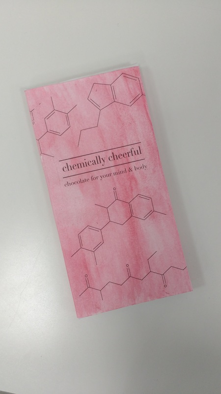
Title: Chemically Cheerful
Size: 7.62cm x 15.24cm
Medium: Adobe Illustrator
Date Completed: 7/28/2016
In July of 2016 I had the chance to participate in a workshop at SCAD, Creative Packaging Design. The concept behind this project was to create a candy bar wrapper that focused on creating a unique experience for the consumer. I chose to highlight the positive effects of chocolate on a person’s mental and physical health with my package design, presenting the consumer with information about the health boost they’d received with each square of chocolate eaten. I also reflected the same idea in the outer package design, featuring the same chemicals chocolate brings to your body, using diagrams of serotonin, endorphins, and flavonoids.
Process
|
In the beginning of this project I felt very lost because I had never tried to do any kind of design work before. I spent a lot of time searching through other design work and interesting candy bar packaging. I really liked some of the bright colors and cut-out designs on some of them, but I wanted my design to have more meaning behind it, not just look nice. The professor suggested I try to focus on the experience of opening the packaging rather than what it looks like.
|
|
|
|
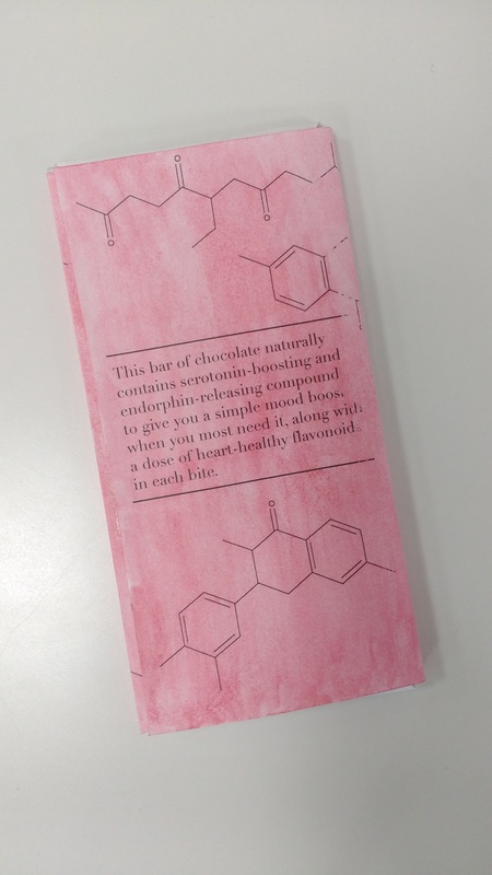
I really wanted to focus on making opening the chocolate a positive experience, highlighting the benefits of eating chocolate rather than the negatives. I started designing the inner wrapping of the chocolate first, adding little messages under each square of chocolate. I began researching the different benefits of eating chocolate, landing on the website for the Medical Wellness Association. I found three different benefits I could use: serotonin-boosts, endorphin-increase, and heart-healthy flavonoids. I wrote up little messages using these three, and placed them on each of the squares where the chocolate would be.
|
|
Now that I had the inner wrapper finished, I needed an outer sleeve that reflected the same concept as the wrapper. I thought about using bright colors to highlight the same positivity I had used before, but I needed a design to make it more interesting, something eye-catching. Since I talked about chemicals like serotonin and flavonoids, I thought about using those to design the candy. I found diagrams of the different chemical structures I had used, just like the ones we’d learned in class earlier. I simplified some of them to give it a cleaner look, then scattered them around a quick template I made of the sleeve.
|
|
Choosing a font was more difficult, because I’ve never worked with typefaces before, or really any kind of design work. I wanted to still reflect the sort of academic feel of the chemistry diagrams, but give it a more modern edge. I looked through different types of typefaces, and liked the ones with serifs, but I didn’t want it to look too traditional or old-fashioned. I went with a more modern serif, one with a bigger difference between thick and thin strokes. I used this for both the title and description of the candy. I then added lines above and below to distinguish it from the rest of the design, and help it stand out.
I made a mockup of my design, printing a black and white version on copy paper, to fold up and make sure all the dimensions were correct, and to make a couple of adjustments. I really wanted to add color to it, but I didn’t have any color ink, or colored paper. Instead I printed it in black and white, then went over the whole thing with a watercolor wash to give it a soft, pastel look.
Reflection
I really like how the design of this project came out. I like the simplicity and clean lines. The only thing I don't like is the way the watercolor came out on the final design, I think it looks a bit splotchy and uneven, and also painting the water color on ended up rubbing off some of the ink in the words and the design.
ACT Components
1) Studying the chemistry and science behind chocolate I think really led me to pursue a more minimalist, cleaner design because I wanted to emulate that same kind of no-nonsense style of the academic research I was reading. The research also affected the way I looked at design and functionality, having to rewrite these very dense, dry articles into something condensed and light for the consumer to want to read.
2) Most authors describing this topic were hesitant to condone the idea that chocolate could have positive benefits, as it's always been seen as unhealthy candy.
3) I've come to the conclusion that creating an experience or process involved with your work can be very powerful in drawing people into your work and solidify positive feelings and ideas towards it in their minds, something I will continue to use in future projects.
4) The central theme around this research was to find a way to make a more positive experience associated with opening this bar of chocolate. Clearly for most people this is already a positive experience, but I wanted to show the consumer that they did not have to feel guilty about eating the product (in moderation) and therefore enhance their feelings of positivity towards it.
5) I inferred that with chocolate there exists sort of a stigma around eating it as with any food seen as unhealthy, along with significant guilt, and I wanted not to erase that but to show the other side, the positives as well.
